
From the inside out: helping Clarkson Alliance reconnect their brand with who they are today
The challenge
Clarkson Alliance have a strong reputation, a loyal client base and a capable, growing team. However, their brand and website were out of step.
The business has evolved under its current directors, David Chapell and Mark Plenty. The logo was no longer working across digital formats and media, with text becoming illegible in certain contexts. The website navigation felt dated. And crucially, the positioning no longer reflected the culture, values or market focus that the team had built.
What the business needed was not just a visual tidy-up. It needed to rediscover what it stood for, agree that internally, and then take it outward consistently.
The approach
Priddey Marketing’s role was to lead the strategic thinking and oversee delivery of the refreshed brand and website.
Strategic positioning work
The starting point was a series of structured conversations with the senior leadership team to get clarity on the fundamentals: market differentiation, target client profile, company values and the culture they were actively building. One early question on the table was whether to change the company name. Working through the pros and cons together, the decision was to retain it. The name has a good reputation and equity in the market. What mattered was being clear about what the business stands for now.
Internal alignment
Before anything went near a design brief, Su facilitated a full-day session with the whole team. The shift the business was making needed to be owned by everyone, not just the directors. That session helped surface the values that were already being lived day-to-day and gave the whole team a shared language for where the business was heading.
Competitor and market research
A detailed competitor review was completed before any creative work began. Priddey Marketing presented findings on how others in the sector were positioning themselves, what language they were using, and where genuine differentiation was available. This informed both the keyword strategy and decisions around tone and messaging.
Logo refinement and agency management
Priddey created the agency brief and facilitated the selection and onboarding process.
With a clear brief grounded in real strategic thinking, the design agency was set up to succeed from the start.
The existing logo needed to be refreshed, so it would work reliably across all digital formats and media without text dropping out or the mark becoming illegible. Su managed the relationship between Clarkson Alliance and the agency throughout, helping the team evaluate concepts objectively and move forward with confidence. The logo went through three iterations rather than the drawn-out back-and-forth that so often derails these projects.
Website strategy and content
One of the most common causes of website projects running over time and budget is clients struggling to produce new copy. Priddey Marketing addressed this directly by taking a lead role in developing the site architecture (working closely on the sitemap with the agency) and then writing the website content page by page, with Clarkson Alliance reviewing and approving. Priddey also organised updated team photography to replace old team and stock photography, that was in keeping with the culture. The agency could focus on design and technical backend rather than waiting on content. The project stayed on track and on budget.
The outcome
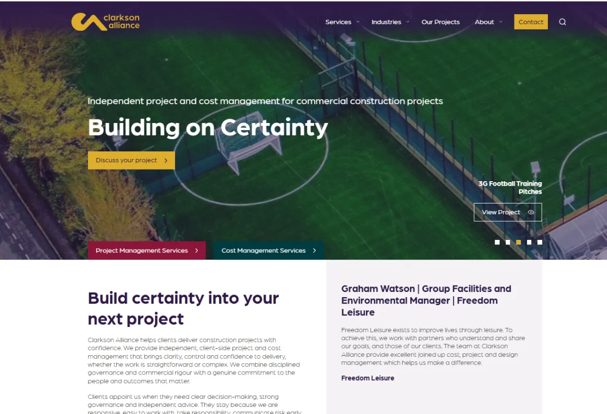
Clarkson Alliance now has a refined logo and a redesigned website that genuinely reflects the business they are today. The new site introduces clearer navigation, updated sector and project content, and messaging that speaks to the clients they are focused on serving.
The total project ran for approximately four months, including the Christmas period, and came in smoothly with no significant delays.
“Our business has evolved significantly over the years and it was important that our brand and website reflected where we are today. The new site gives a clearer picture of our experience and the sectors we work across.”
David Chapell, Director of Cost Management, Clarkson Alliance
“The website better represents the scale and range of projects we deliver and the team behind them, while making it easier for clients to explore our work.”
Mark Plenty, Director of Project Management, Clarkson Alliance
What this work reflects
This project is a good example of what strategic marketing leadership actually looks like in practice. The website was the end product, but the real work happened upstream: getting clarity on positioning, building internal alignment, researching the market and translating all of that into a brief the agency could execute well.
It is also a reminder that the most common blocker on projects like this is not the design. It is having a clear brief and copy. Having senior marketing input from the outset, including hands-on support with content development, meant the project moved at pace and the client team was not left carrying a task they were not resourced to do well.
Old Logo and Design

New Logo and Design